Task 1 — Visualizing Clustering Results
Apply KMeans and KMedoids with k=5 (because we know from the ground truth that there are 5 labels).
- Make three plots side by side — two showing the clusters your models learned, and the last one showing the ground truth.
- Each plot must have a title, axis labels, and legend.
- For the KMeans and KMedoids plots, also plot the centroids using a differently shaped marker (e.g. ×).
- Put this side-by-side plot in your report and give a brief analysis of how well the models appear to be doing.
What we did
We loaded vehicles.csv (250 rows, features: weight and speed, 5 ground-truth vehicle classes). We fit KMeans(n_clusters=5) and KMedoids(n_clusters=5) with random_state=42, then produced a 3-panel figure using plt.subplots(1,3):
X_t1 = df[['weight', 'speed']].values   # 250×2 feature matrix
y_t1 = df.iloc[:, -1].values            # ground-truth labels (1–5)

k = 5
km_t1   = KMeans(n_clusters=k, random_state=42, n_init=10)
kmed_t1 = KMedoids(n_clusters=k, random_state=42)
km_t1.fit(X_t1)
kmed_t1.fit(X_t1)

palette = plt.cm.tab10(np.linspace(0, 0.9, k))
fig, (ax1, ax2, ax3) = plt.subplots(1, 3, figsize=(21, 6), sharex=True, sharey=True)

# KMeans panel
for cid in range(k):
    m = km_t1.labels_ == cid
    ax1.scatter(X_t1[m, 0], X_t1[m, 1], s=20, color=palette[cid], label=f'Cluster {cid}')
ax1.scatter(km_t1.cluster_centers_[:, 0], km_t1.cluster_centers_[:, 1],
            marker='x', s=200, linewidths=3, color='black', zorder=5, label='Centroids')
ax1.set_title('KMeans (k=5)');  ax1.set_xlabel('Weight');  ax1.set_ylabel('Speed')
ax1.legend(fontsize=8)

# KMedoids panel
for cid in range(k):
    m = kmed_t1.labels_ == cid
    ax2.scatter(X_t1[m, 0], X_t1[m, 1], s=20, color=palette[cid], label=f'Cluster {cid}')
ax2.scatter(kmed_t1.cluster_centers_[:, 0], kmed_t1.cluster_centers_[:, 1],
            marker='x', s=200, linewidths=3, color='black', zorder=5, label='Medoids')
ax2.set_title('KMedoids (k=5)');  ax2.set_xlabel('Weight');  ax2.legend(fontsize=8)

# Ground truth panel
for lbl in np.unique(y_t1):
    m = y_t1 == lbl
    ax3.scatter(X_t1[m, 0], X_t1[m, 1], s=20, label=f'Vehicle class {int(lbl)}')
ax3.set_title('Ground Truth');  ax3.set_xlabel('Weight');  ax3.legend(fontsize=8)
plt.tight_layout();  plt.show()
How the code works
KMeans iteratively assigns each point to the nearest centroid (arithmetic mean), then recomputes centroids until convergence — minimising within-cluster sum of squared distances. KMedoids does the same but constrains each centroid to be an actual data point (the medoid), making it more robust to outliers.
For plotting, km_t1.labels_ gives the cluster index for each point and km_t1.cluster_centers_ gives centroid coordinates. Centroids are plotted with marker='x' in black, clearly distinguishable from the data points.
Result
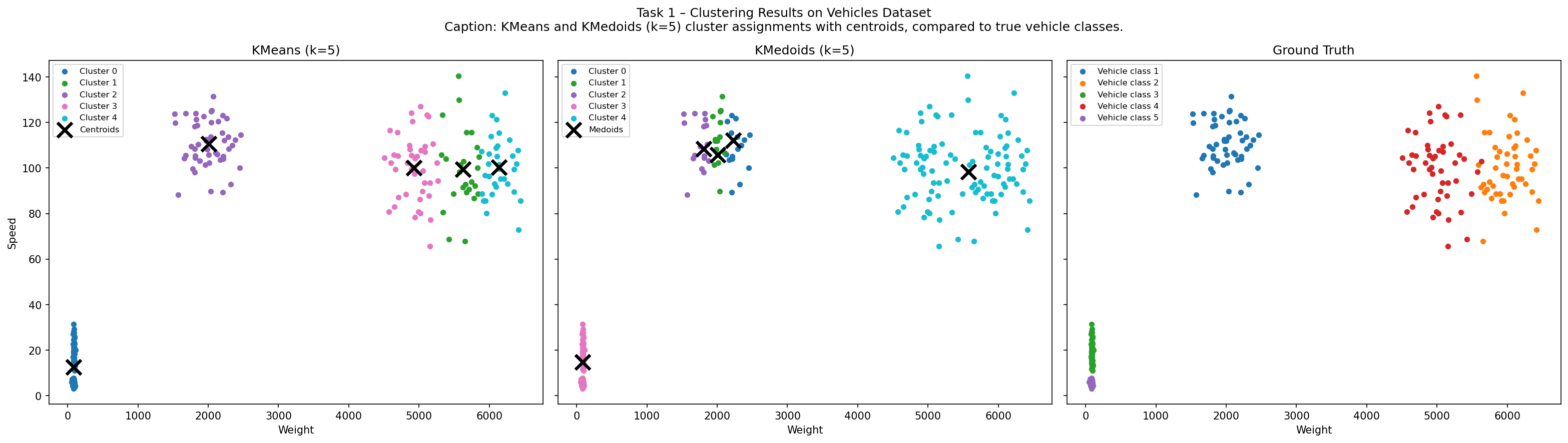
Analysis
Both KMeans and KMedoids recover a 5-cluster partition that closely matches the ground truth. The vehicle classes form roughly convex, well-separated blobs in weight-speed space — exactly the structure both algorithms are designed for.
The key structural difference: KMeans centroids lie at the arithmetic mean of each cluster (can sit in empty space), while KMedoids centroids are always actual data points. Visually, the two predicted clusterings are nearly identical. Minor disagreements occur at cluster boundaries where classes overlap, but overall performance is strong on this dataset.